

General SEO
Most updates that we release go by largely unnoticed by the crowd, but sometimes we release an update that we suspect will get a more vocal response. The recent autumn update is most definitely in the latter category, and we, therefore, felt that it was appropriate to write an article detailing the background and reasoning behind the changes that we made.
This story goes back to the very early days of Wincher. Back then, the target market was mainly small website owners who wanted to track the rankings for a dozen or so core keywords. Thus, when designing the initial interface the obvious way of visualizing the trends and changes in rankings was a line chart with the date on the X-axis and position on the Y-axis:
Looks great, right? Well, as time went by things changed… We got more customers and bigger customers. We soon had plenty of customers tracking hundreds of domains with hundreds or even thousands of keywords added to each one. One thing still remained constant though, and that is the ranking history graph above. No matter how many keywords were added to a website, the data would be visualized in the same way. What this meant is that many customers saw something like this when logging in to their dashboards:
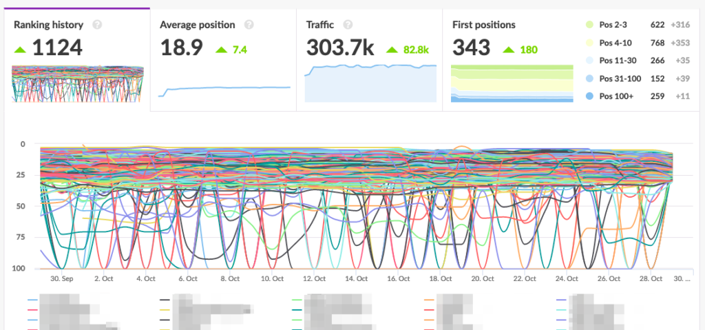
Not quite as pretty, huh? The graph is almost completely illegible and identifying the line for a specific keyword is definitely impossible. Because of this, internally, this graph has been nicknamed the “spaghetti graph”. In addition to making the UI look messy, it also causes performance issues once a certain amount of keywords is reached. Over time we have played around with different workarounds for this problem since removing it completely would be a huge leap. After all, it had been there from the very beginning…
One thing that we tried was connecting the graph to the pagination of the keywords table below, thus only showing a small subset of keywords at once. A decent idea in theory, but proved very confusing in practice since the pagination is at the very bottom of the page and the graph at the very top.
Another thing we attempted was adding keyword starring along with the ability to save the current filter as a default view. We figured the problematic customers could utilize this to easily save a default view that only contained the keywords they cared the most about. However, adoption did not prove satisfactory.
One autumn morning we finally had enough. It was time to take the plunge into the abyss… The “spaghetti graph” had to go. The question still remained: how? Removing it outright still seemed outrageous since it was the core functionality of the product. We ended up with a compromise: moving it out of the default view.
The graph is still there, but it now requires you to specifically request it by selecting any amount of keywords from the table and then clicking on the “Ranking history” button:
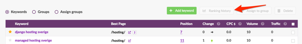
Some other things of note in the picture:
While we had now found a new home for the Ranking history graph, one question still remained: what to replace it with? What we came up with was to use the position volatility data but group it by day:
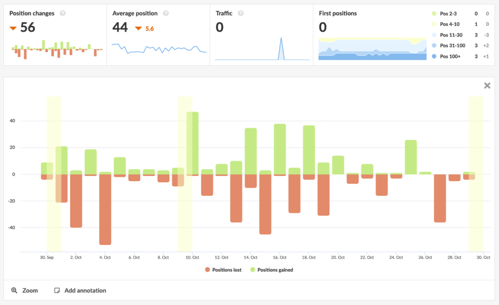
This graph shows you the number of positions gained and lost per day in the selected period. This makes it really easy to identify days with a lot of turbulence without making a mess like the ranking history graph used to. Smooth, huh?
As we mentioned earlier, we also made a lot of exciting changes to the “Ranking path” column. Previously, this column simply showed you the highest ranking page for a keyword. While interesting, there was a lot of untapped potential for the data.
The table now also differentiates between paths on different subdomains, presenting the subdomain in a separate column. It’s also possible to filter on a specific subdomain from the filter bar:
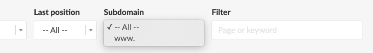
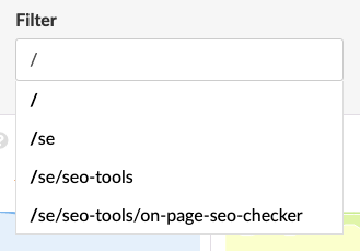
You may have noticed that the filter box now also mentions “page”. That’s because it’s now also possible to filter on a specific page by starting your filter query with a forward slash:
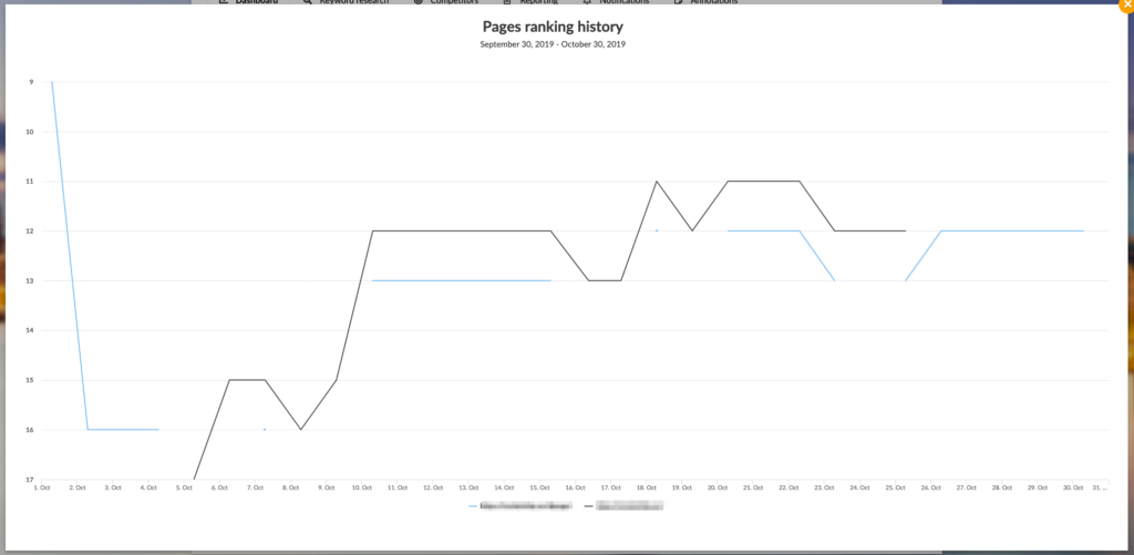
The table now also shows you how many other pages are ranking for a certain keyword, indicated by the number next to the best page. By clicking on the number, you’re presented with a graph showing you the ranking history for all the pages:
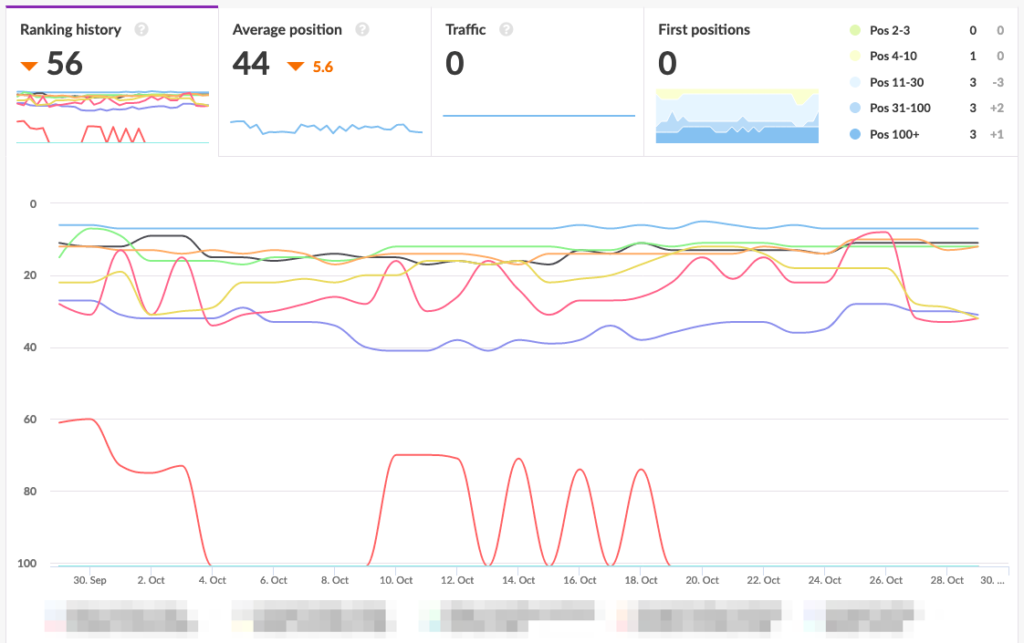
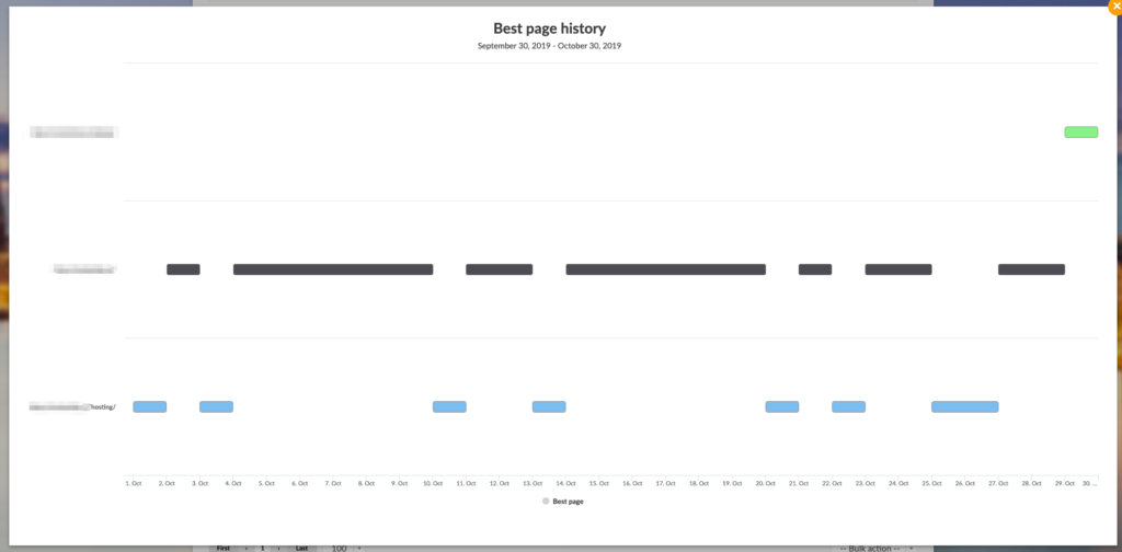
Keyword cannibalization is a hot topic in the SEO industry. Having two (or more) pages on the same site competing for the top spots on the same keyword is usually not the best idea. This means that Google has a difficult time determining which page is the most relevant and may have a negative effect on your ranking. Luckily, Wincher now has a way to visualize this problem in a simple manner. By clicking on the best page you’re brought to this graph which in this case is clearly showing three competing pages:
All in all, this update brought on some fairly controversial changes, but we think it’ll have a positive effect on your workflow overall. We hope that this article helped you understand our reasoning behind the changes, even if you’re not feeling a hundred percent satisfied with some of them.
As always, if you have any feedback for us (good or bad) we’d love to hear it! We’re always available by clicking on the support button in the lower right corner of the screen.